Creating Detailed User Personas for Targeted Design Solutions
User Research
Oct 9, 2024
Creating Detailed User Personas for Targeted Design Solutions
User Research
Oct 9, 2024

We share the top strategies for creating effective responsive designs that ensure your site looks great and functions well on any screen size.
We share the top strategies for creating effective responsive designs that ensure your site looks great and functions well on any screen size.


Embrace a Mobile-First Approach
Starting with a mobile-first design strategy means prioritizing the user experience on smaller screens and then progressively enhancing it for larger devices. This approach ensures that essential content and functionality are accessible and optimized for mobile users, who now constitute a significant portion of web traffic.
By focusing on mobile first, you address the constraints of smaller screens and bandwidth limitations, creating a streamlined and efficient design. As you scale up to tablets and desktops, you can add more complex features and design elements, ensuring a cohesive and performant experience across all devices.
Use Fluid Grids
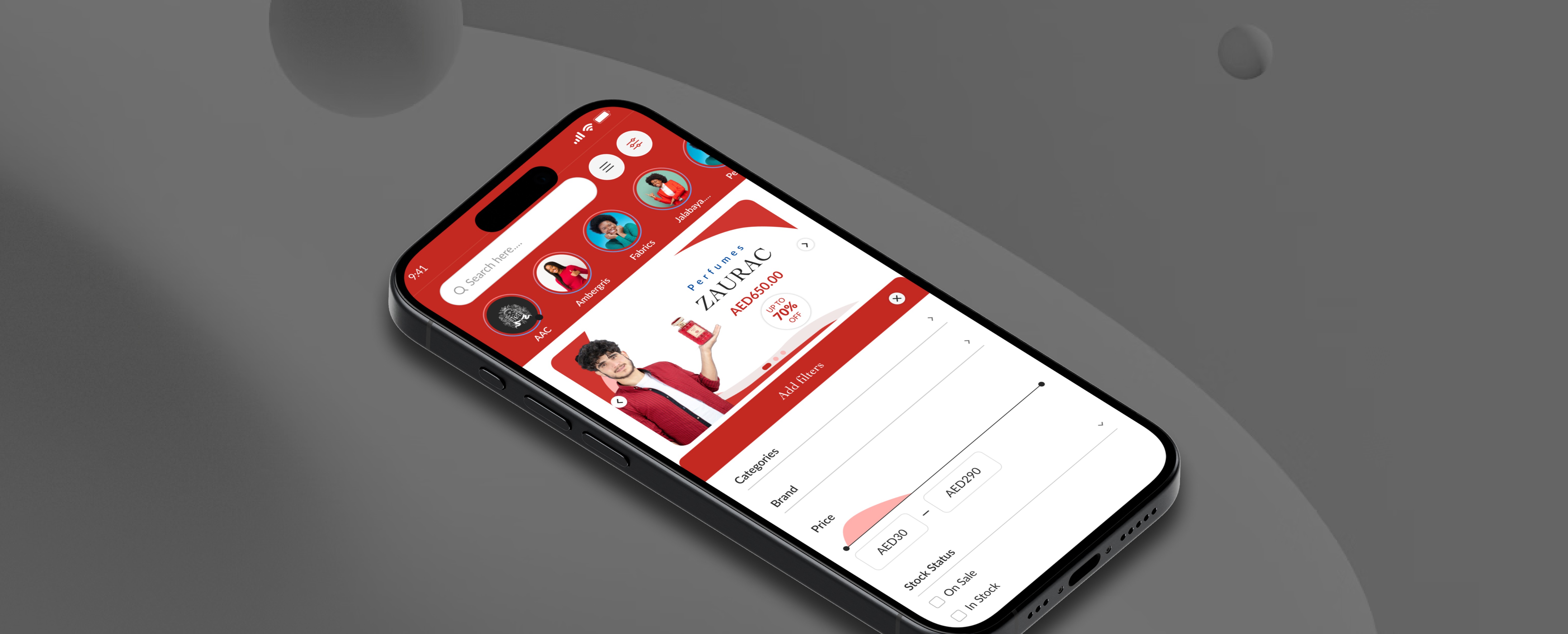
Create a flexible grid layout that adjusts based on the screen size.
Fluid grids use percentages instead of fixed measurements, allowing content to resize smoothly.
Ensure images and media elements are responsive by using CSS techniques like max-width: 100%.
Serve appropriately sized images using the srcset attribute and modern image formats like WebP.
Embrace a Mobile-First Approach
Starting with a mobile-first design strategy means prioritizing the user experience on smaller screens and then progressively enhancing it for larger devices. This approach ensures that essential content and functionality are accessible and optimized for mobile users, who now constitute a significant portion of web traffic.
By focusing on mobile first, you address the constraints of smaller screens and bandwidth limitations, creating a streamlined and efficient design. As you scale up to tablets and desktops, you can add more complex features and design elements, ensuring a cohesive and performant experience across all devices.

Use Fluid Grids
Create a flexible grid layout that adjusts based on the screen size.
Fluid grids use percentages instead of fixed measurements, allowing content to resize smoothly.
Ensure images and media elements are responsive by using CSS techniques like max-width: 100%.
Serve appropriately sized images using the srcset attribute and modern image formats like WebP.
“Design isn't just about aesthetics—it's about enhancing functionality. A great design blends form and function to deliver a seamless user experience.”
“Design isn't just about aesthetics—it's about enhancing functionality. A great design blends form and function to deliver a seamless user experience.”
Implement Flexible Typography
Employ relative units such as ems and rems for font sizes instead of fixed pixels, allowing text to scale proportionally with the user's settings and screen size.
Implement Flexible Typography
Employ relative units such as ems and rems for font sizes instead of fixed pixels, allowing text to scale proportionally with the user's settings and screen size.


Latest posts
Latest posts
Design Tips
Aug 15, 2024
Learn best practices for selecting and using fonts in your design projects.
Visual Design
Aug 10, 2024
Color theory plays a vital role in design. Explore the fundamentals of color theory.
Prototyping
Oct 25, 2024
Choosing the right prototyping tools can make a significant difference in your design workflow.
Let’s talk
Let’s talk
Let’s talk
Let’s talk
Let’s talk
Let’s talk
Let’s talk
Let’s talk
Let’s talk
Let’s talk
Let’s make your
Website shine
Let’s talk
Let’s talk
Let’s talk
Let’s talk
Let’s talk
Let’s talk
Let’s talk
Let’s talk
Let’s talk
Let’s talk
